I help mission-driven businesses
create a distinctive and memorable brand!
UforChange Annual Report
UforChange is a non-profit organization focused on empowering youths. In their annual report for 2022 – 2023, I wanted to highlight their community of positivity, power, and unity by using UforChange’s bold colours for the path that they all walk through together for the cover. For the rest of the annual report, I wanted to showcase the various classes and courses they taught along with little illustrations to emphasize the topics and the students’ experiences.

Fundraiser Posters
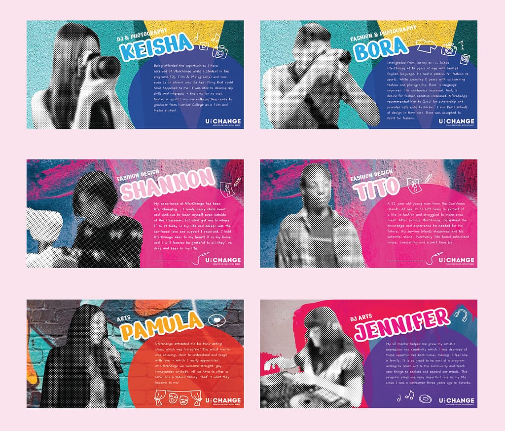
These are a set of posters designed for a fundraiser on behalf of UforChange to showcase the classes and courses that they offer for youth. Each colour palette corresponds to each of the different classes. Pictures of the students were blurred for anonymity, contrasting against the bold and colourful wall art in the background. Little illustrations are used to visually describe each class and activity.
TerraSphere
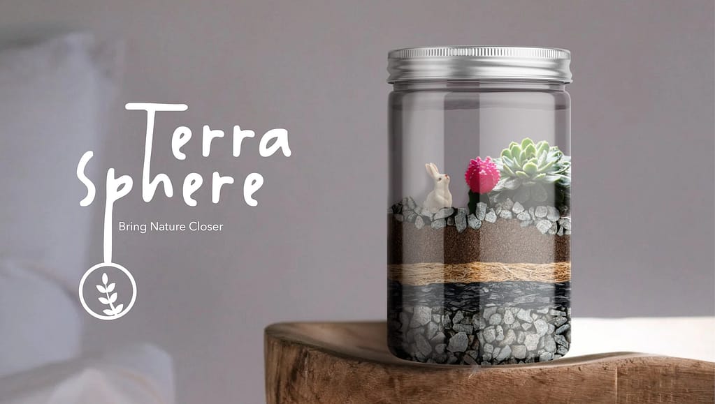
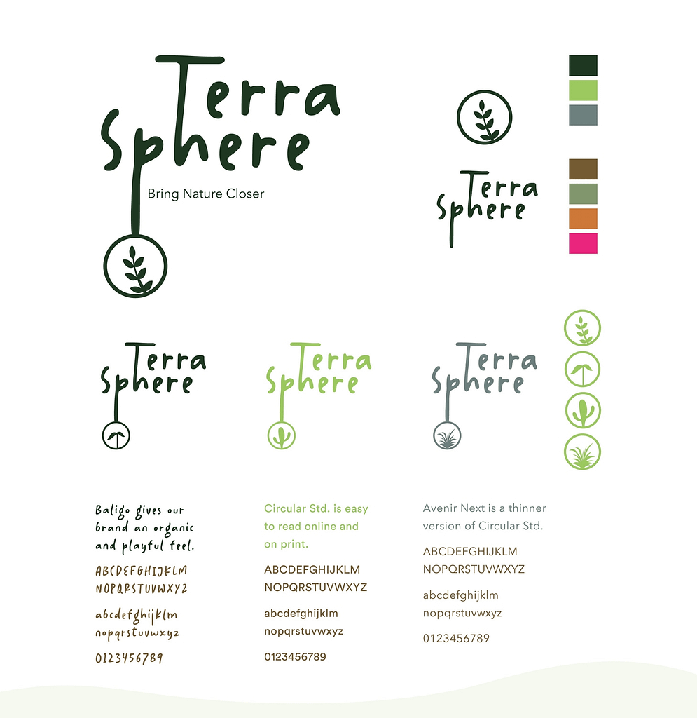
TerraSphere is a company that creates terrarium DIY kits. I was in a group of 5 others and worked as the Creative Director. I designed the concept and assigned roles, managed the process and held meetings every week. This was a school project where we had to create a brand from scratch along with a launch campaign.
Terrariums imitate the water cycle in ecosystems, allowing it to survive in an enclosed container with just an occasional spray of water. Aftercare is very easy for this project! Our target audience was young people between the ages of 7-18.
Our launch campaign would be held in the CNE (Canadian National Exhibition) in the kids’ area close to the entrance. Children can participate in it to get a free DIY kit and assemble it with staff and their parents/guardians! It would also be a collaboration with LEGO, where they also get a small figurine to place inside the terrarium once it’s finished. The idea is to create a new home for their new buddy. The event would be an educational and fun experience for the families while also promoting the brand.

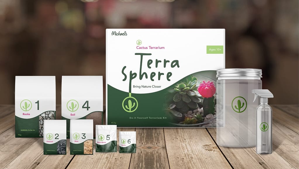

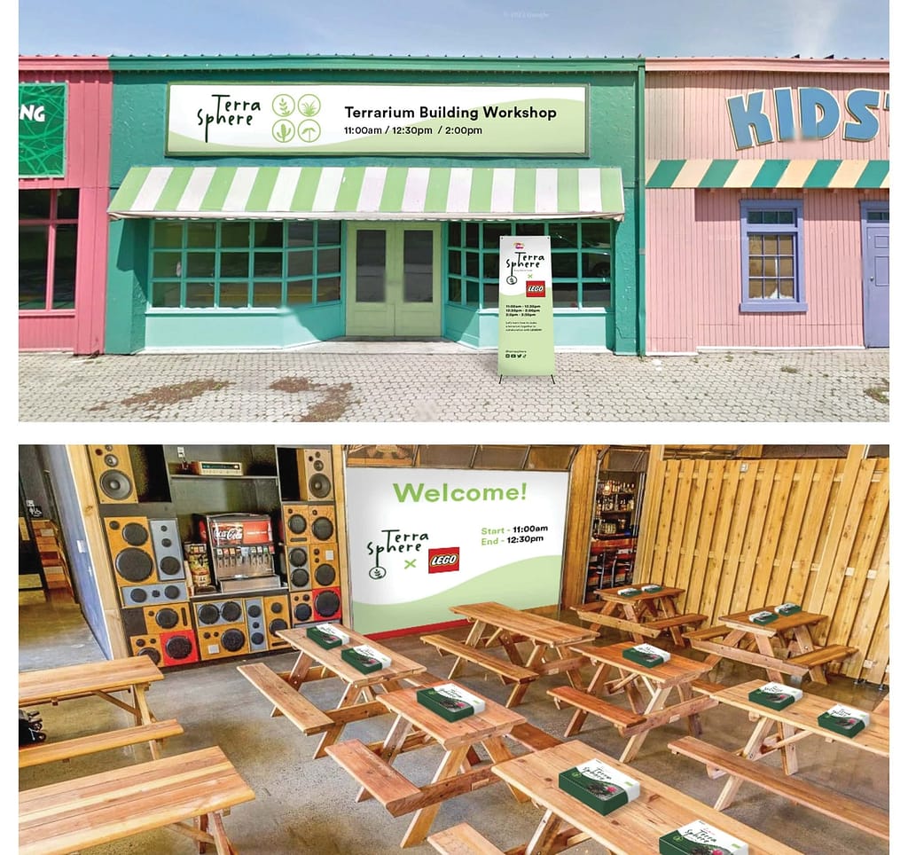
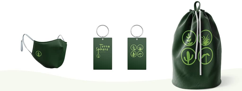
Disclaimer: This was a student project. We are not affiliated with Michaels Stores Inc. or The Lego Group.
Shift22 Campaign
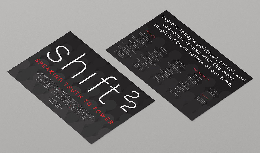
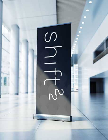
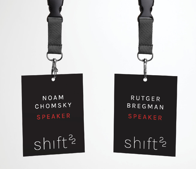
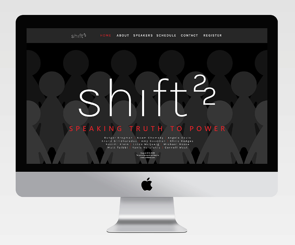
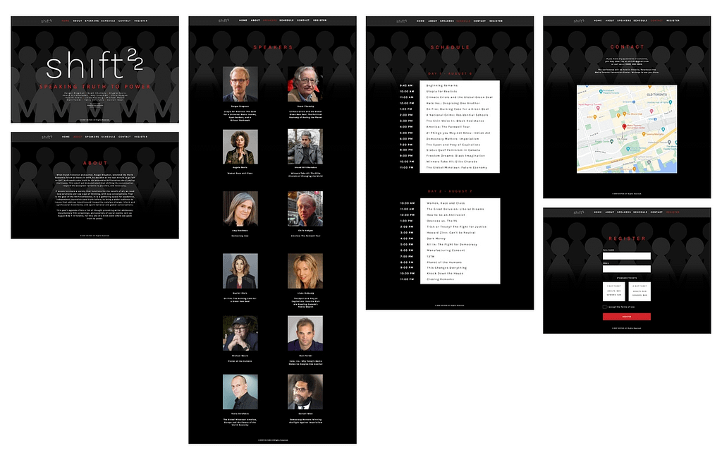
Shift22 is a writers conference that will discuss world social issues, politics, and economics. I wanted to communicate the weight of the topics discussed in the conference through my use of colours and illustrations. Red is used to indicate warning, and the illustrations in the background of people together in a crowd is to describe the power we hold through unity.
Weston CI Redesign
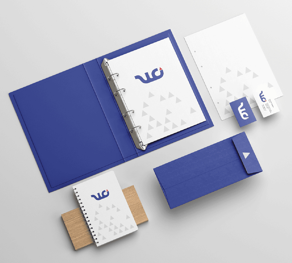
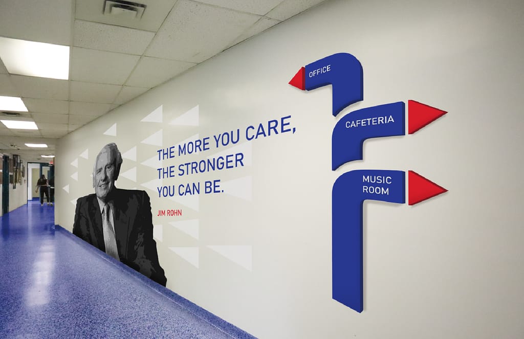
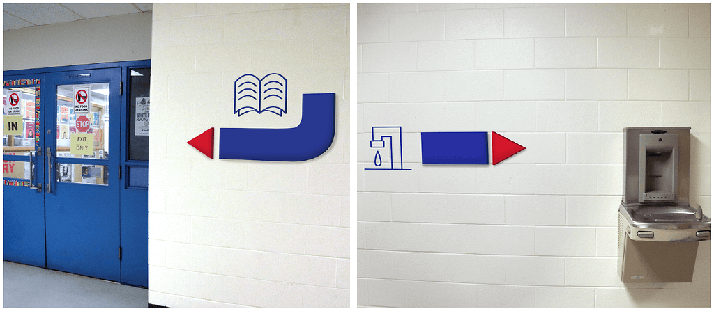
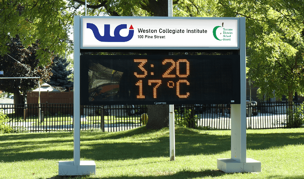
Weston Collegiate Institute is a high school that has an outdated interior and branding design. We were to completely rebrand it and also add in signage throughout the hallways for students and guests. The arrow in the logo is a repeating element to symbolize the pathways for students to their futures. Icons are used in hallway signage to make it as accessible and visible as possible.

Zevia Campaign
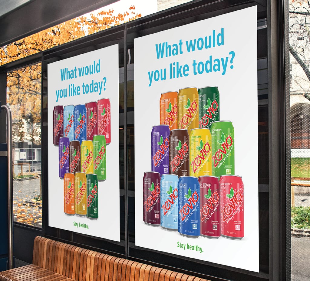
Zevia is a company that creates healthy carbonated drinks using natural sweeteners. The goal of this campaign was to appeal to the demographic of people that drink alcohol. This needed to be approached carefully, as a majority of Zevia’s audience were under the age of 16. In the first phase of the campaign, I decided to showcase the variety of flavours that Zevia had while also reminding consumers that although it was a carbonated drink, it was healthy.
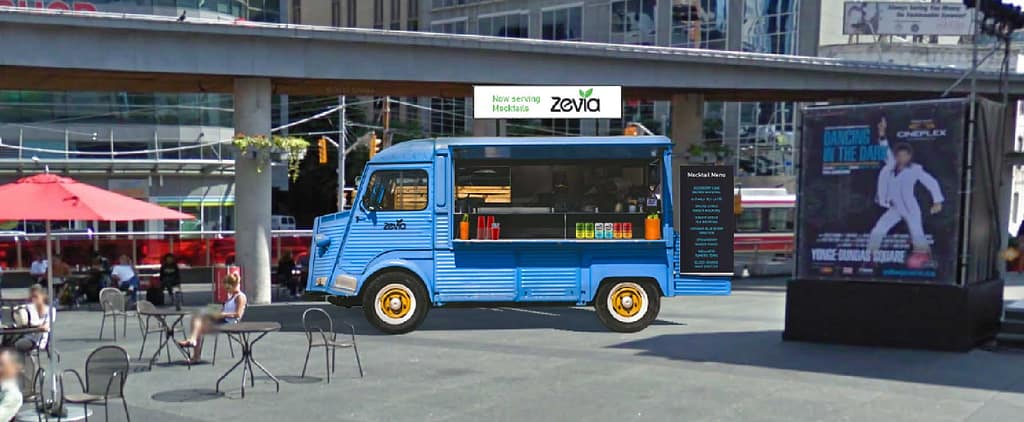
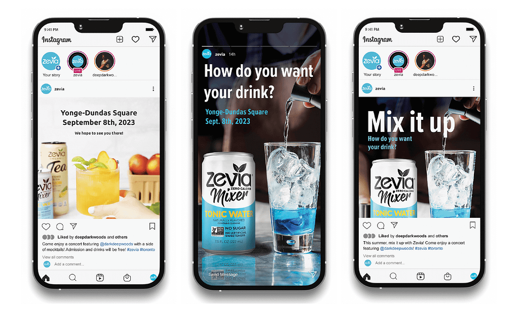
In the second phase of the campaign, we would advertise the free recipes of mocktails on Zevia’s website. Since mocktails are alcohol-free, it was family friendly and would also spark curiosity and imagination in the target demographic of this campaign. The campaign would also feature a beverage truck offering free samples of mixed mocktails during a free concert in downtown, promoting the products and mocktail recipes during a large event.
Disclaimer: This was a student project. I am not affiliated with Zevia.
Discursive Magazine
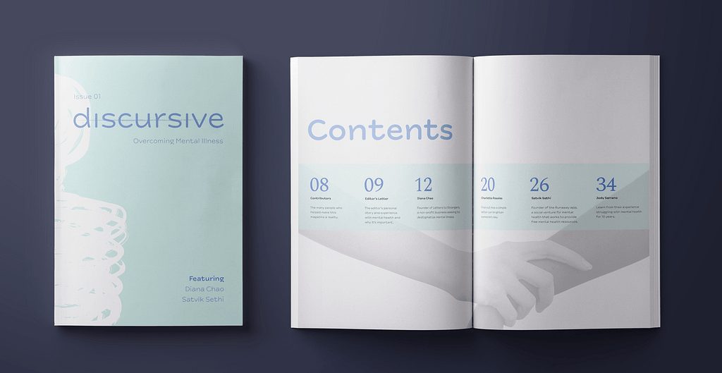
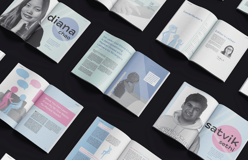
Discursive is an independent magazine that talks about overcoming mental health, specifically depression and anxiety. This was a passion project of mine. It features two young leaders and their achievements in helping others with mental health, inspirational and words of motivation, and illustrations of my own to support each page spread.
What I enjoyedthe most about this project was the colour palette change halfway through the magazine. I wanted to visually demonstrate that although our lives will, at times, seem bleak, hopeless, or meaningless, it is not forever.
Lorem ipsum dolor sit amet, consectetur adipiscing elit. Ut elit tellus, luctus nec ullamcorper mattis, pulvinar dapibus leo.
Lorem ipsum dolor sit amet, consectetur adipiscing elit. Ut elit tellus, luctus nec ullamcorper mattis, pulvinar dapibus leo.
Lorem ipsum dolor sit amet, consectetur adipiscing elit. Ut elit tellus, luctus nec ullamcorper mattis, pulvinar dapibus leo.